0
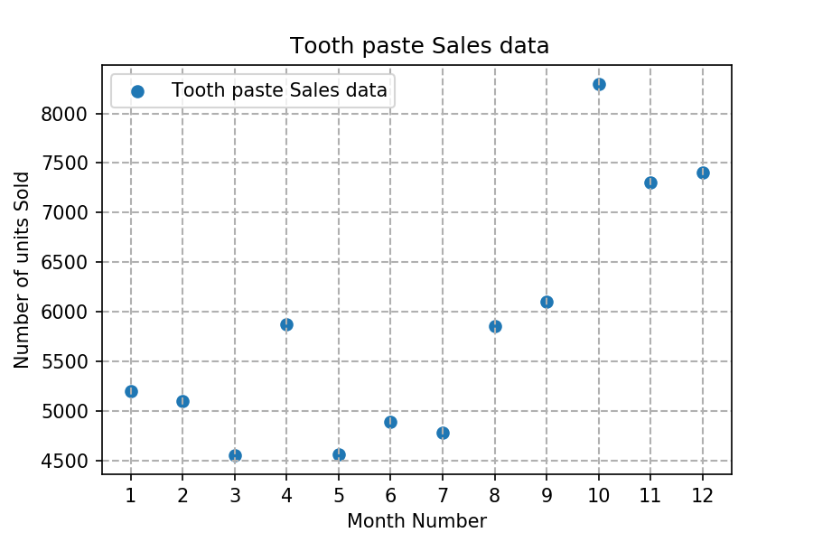
Read toothpaste sales data of each month and show it using a scatter plot
Also, add a grid in the plot. gridline style should “–“.
The scatter plot should look like this.


belongs to collection: Python Matplotlib Exercises
Also, add a grid in the plot. gridline style should “–“.
The scatter plot should look like this.
total answers (1)
 Python programming